Baskerville Was Framed: Notes from the Front Line of Britain’s Fiction Font Feuds
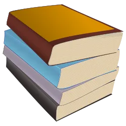
Photo: eady, CC0, via Wikimedia Commons
A reader of my acquaintance once returned a novel to a bookshop in Leeds with a note that read, in full: “Lovely story. Shame about the typeface.” The bookseller, who had been braced for a complaint about the ending, framed the note instead. It hangs behind the till to this day — a small monument to the fact that British readers care about typography far more than they will ever admit out loud.
We are a nation that argues about fonts in whispers. Nobody wants to be the person who says “I found the leading a bit mean” at a book group, and yet that person exists in every book group, sitting quietly, marking your paperback down.
The Typeface as Costume Drama
Fiction typography is never a neutral delivery system. It is costume. A novel set in a compact old-style serif with generous margins is announcing that it is a serious book, possibly about a marriage in Wiltshire, possibly with a lighthouse. A novel set in a chunky humanist sans is announcing that it wants to be read on a train and will not be asking much of you. And a novel set in whatever happened when nobody in production opened the file is announcing, unintentionally, that the whole enterprise may have been outsourced to a printer in a hurry.
Here is the cruelty of it: readers do not blame the designer. They do not even know the designer exists. They blame the book, and then they blame the author, and then they blame themselves for finding a perfectly good plot oddly resistible.
Overheard at the Counter
A bookseller in Bristol — let us call her Ruth, because she asked me to — reckons she can predict a return from the typeface alone. “There’s a certain chunky sans on a literary hardback,” she says, “and people bring it back saying they couldn’t get into it. They never say why. But it’s never the plot.”
Her colleague, a man of strong views and a tattoo of an ampersand, is blunter. “A bad font makes a good sentence look like a paragraph from a manual. You read three pages and you feel tired. You assume the book is tiring. The book is fine. The book is innocent.”
The Designer’s Defence
Which is, of course, exactly what a designer would say. And they would be largely right. Setting a novel is a negotiation between line length, page size, paper bulk and the awkward fact that a 400-page hardback must not look like a breeze block. Small type on cheap paper saves money and costs readers their eyesight. Airy type on decent stock costs money and earns goodwill. Publishers know this. Budgets know it louder.
There is also a quiet snobbery at work. Serif faces feel like literature because we have been trained by a century of paperbacks to think so. Sans-serif feels like signage, software or a leaflet about recycling. None of this is typographically true. All of it is culturally true, which is worse.
The Argument League Table
Ranked by likelihood of starting a genuine row at a book group, where the wine is open and the evening is young.
1. Garamond. The quiet aggressor. Beautiful at large sizes, oddly ethereal at 10pt, and responsible for more “I just couldn’t settle to it” verdicts than any plot twist. Makes a thriller look like a wedding invitation to a wedding you weren’t invited to.
2. Times New Roman. The font of homework, of covering letters, of everything that has ever been due on a Friday. Structurally flawless. Emotionally a form to fill in.
3. Baskerville. The safe literary choice, and the reason half of British fiction looks identical on a shelf. Nobody dislikes it. Nobody has ever been excited by it. It is the Boden catalogue of typefaces: dependable, slightly pleased with itself.
4. Palatino. Warm, wide, faintly academic. Screams “set text” in a way that makes readers feel they should be taking notes.
5. Gill Sans. Britain’s institutional voice. Beloved of signage, transport and, unfortunately, novels about quirky families. Reads as though the book might ask you to mind the gap.
6. Courier or any typewriter face. Deployed to signal “this novel is charming and epistolary and possibly about a bakery”. Rarely wrong, never subtle, exhausting after eighty pages.
7. Handwriting fonts. Illegal, frankly. Should be referred to the relevant authorities.
8. Any sans on a literary hardback. Guaranteed to prompt the phrase “it feels like a proof copy”, which is the politest insult in publishing.
How to Complain About a Font Without Becoming Insufferable
First, check the leading. Nine times out of ten the problem is spacing, not shape, and spacing is a thing you can describe without using the word “kerning” in company. Second, blame the edition, not the author — a novel can be beautifully set in one printing and miserable in another, which is an excellent excuse for buying the nicer one. Third, remember that fonts are a matter of taste dressed up as a matter of fact, and that the person opposite you may genuinely love Garamond.
They are wrong, obviously. But they may love it.
A Modest Conclusion
No novel has ever been saved by its typeface. Plenty have been quietly sunk by one — returned at the counter, unread, with a shrug and a note about the ending that was never really about the ending at all.
So spare a thought for the typesetter, who toils unseen, gets no signing queue and takes the blame for a whole book’s atmosphere. Then go and look at your own shelves. Somewhere in there is a novel you abandoned at page forty for reasons you have never quite explained. Now you know.